JK


Illusive illustrator that simply signs work under JK.
Frequently posted ok Will Bankhead's blog, The Trilogy Tapes.

Ellipsis Illustration


Joy Orbison


Photo: Will Bankhead

Ellipsis EP


Joy Orbison


RA: Ellipsis

Resident Advisor review of Ellipsis:

Joy Orbison has had a lot of "big tunes" over his short history, and most of them have had an identifiable vocal at their centre. "Ellipsis" is no different. This one's "we just used to like...do our own thing" sample comes from an interview with drum & bass duo Source Direct, and it's an apt description of Orbison himself. Joy Orbison has been doing his own thing throughout his short career, and it's only from impeccable timing that "Ellipsis" sounds achingly relevant upon its release on his Hinge Finger label. I wrote about the collision between "bass music" and "house" in a feature earlier this year, and it doesn't get much more exemplary than this piece of wax.

But what makes "Ellipsis" so special? Part of it is that sample, instantly recognizable if not just for how strange it is. But it's also got a killer squirmer of a bassline, which initially makes it out to be another rambunctious "UK bass" track. Then that piano hits: it's the sun breaking through the clouds and all those other clichés, but instead of a fey moment of retro chic it feels enormously powerful, especially with that bassline rumbling underneath. Heavy enough for the dubstep kids, nimble enough for the house heads. Producers like Shed and Martyn have recently used synth-heavy overtures to recapture early rave histrionics, and here Peter O'Grady manages to do it with some slamming ivories.

Speaking of Shed, he takes the flipside with a Head High remix, appropriate given that alias' own experiments with piano rave. His remix is every bit as stiff and breaky as you'd expect—probably more so—as the piano riff is strangled beneath close, pummeling breaks. It loses the litheness of the original in exchange for bumbling brute power, and though it has nothing on the original, it makes for a nice alternative.


Source Direct

Lola Da Musica was a Dutch TV Series in the 1990s.

Episode: Drum & Bass

Part 1: Square Pusher
Part 2: Photek
Part 3: Source Direct

Hey whats up, I'm Jim, Source Direct. This is Phil.

Hey my names Phil from Source Direct  we're making Drum and Bass for the next century. Check the rims.

We're twenty now, but erm, we started getting involved in the scene when we were about, I don't know fourteen fifteen because I was listening to tunes at school, and I was sort of the odd one out where I'd be into my techno and house and breakbeat, and like other people where sort of into their pop, sort of thing and their indie thing and it just wasn't me, I was more into that sort of thing that no one was into, I was always looking for that cutting edge, like music. So I was just into that a long time ago and then we started doing parties, illegal parties in the area, where we were living, created a bit of a storm with the police and all that sort of thing. We just used to like, do our own thing, we just used to like.

This interview was sampled by Joy Orbison and is used in his track entitled Ellipsis.


Screen shots taken from credits:


Joy Orbison - Ellipsis


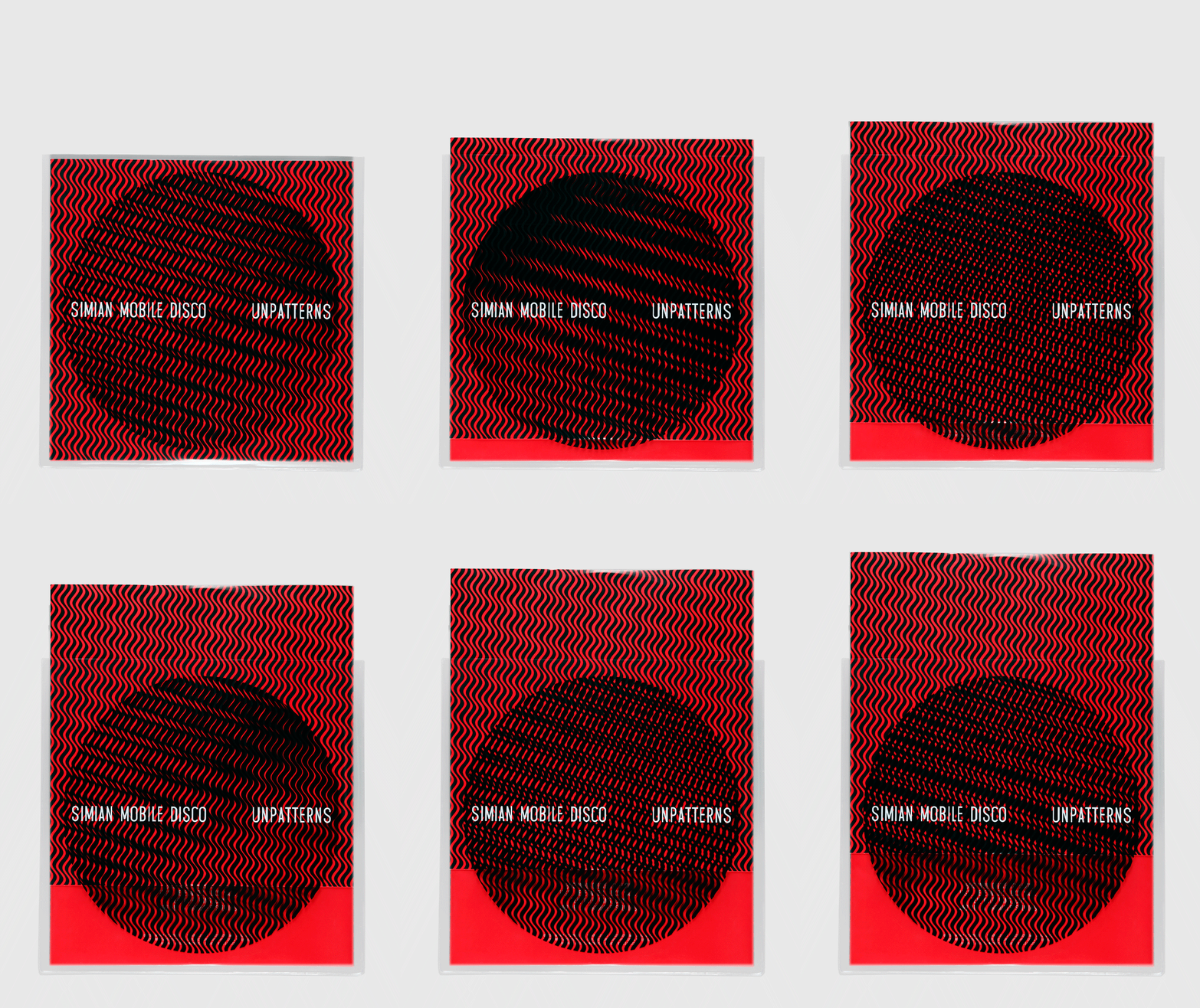
Underpatterns

Simian Mobile disco play on the name of their LP 'Underpatterns' to create some awesome packaging ideas.


The Green Series

A collaborative project between Bleep.com, GiveUpArt and photographer Shaun Bloodworth.
A series of limited edition vinyl releases, exploring techno music, coming soon to your local independent record store... 


Wallpaper*

If we were a suburban busybody, we’d spend a great deal of our time consumed by nosiness about what number 27 was doing to their lawn or how number 41 afforded TWO new cars last year. We’re not suburban busybodies (mercifully – it must be exhausting) but we are magazine publishers and as such we are always keen to have a snoop at what others in the industry are up to, and never more so than when a major title undergoes a redesign.

For its September issue the team at Wallpaper* have done just that. At the heart of the changes are two new typefaces – Portrait described as a “sharply elegant Latin serif” and Darby " a humanist sans serif which will replace Plakat (Graphik) which has been used in the title since 2007. Interestingly creative director Sarah Douglas told Creative Review that it was the “differing personalities” of fonts once released into the public domain which is behind the typographic changes.

Meanwhile the layout has been refined to create pages that editor-in-chief Tony Chambers says are defined by a “fresh, sophisticated, modern elegance” in a bid to facilitate “longer and more indulgent reads” while a higher quality paper stock also seeks to harness the qualities of the printed medium more effectively. Nicolas Roope of Poke London and Marc Kremers were brought in to oversee the polishing up of the magazine’s online offering.


It feels like a step in the right direction for one of our sector’s most iconic names and proof that Sarah has stamped her mark on the design since replacing Meirion Pritchard earlier this year.


Praline

From the exposed spine to the striking coloured sections and the excellent use of infographics and photography, this is yet more proof (not that any was really needed) that Praline is a studio that early knows its design onions.


To reflect the range of colours used in the design of the UK Now identity, a colour was applied to each section of the book, indicating a change of content and supporting the theme of diversity. The different colour sections were then exposed on the open spine.